The Truth About Your Favorite Font – And It's Not Good News for Comic Sans Fans
Understanding the Psychology Behind Font Choices
Fonts have long been a part of our digital and print experiences, with over half a million options available to users. From the classic Calibri to the quirky Wingdings, each typeface carries its own unique personality. A recent study has uncovered what these choices might reveal about individuals, offering insights into how different fonts are perceived across various demographics.
Adobe conducted a survey involving 1,013 Americans, asking them about their opinions on 13 popular fonts, including Helvetica, Times New Roman, Calibri, Arial, Comic Sans, Roboto, Courier New, Verdana, Impact, Lobster, Georgia, Wingdings, and Papyrus. The results highlight not only the popularity of certain fonts but also the associations people make with them.
Popular Fonts and Their Perceptions
Times New Roman emerged as the most popular font, chosen by 27% of respondents. This font, first designed in 1931, is often associated with professionalism and formality. It was followed by Calibri (16%), Helvetica and Arial (both 12%), and Georgia (8%). Men were found to be 45% more likely than women to prefer Times New Roman, while Gen Z showed a strong affinity for it, with over one-third considering it their favorite.
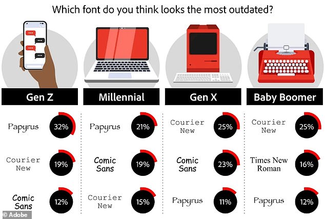
In contrast, Wingdings was labeled as the 'cringiest' font, with 55% of respondents finding it unappealing. Other fonts that received negative feedback included Comic Sans (17%), Papyrus (11%), Lobster (8%), and Impact (3%). Adobe noted that 45% of participants felt Wingdings should be retired entirely, with 15% sharing the same sentiment for Comic Sans.
Font Associations and Professional Implications
The survey also explored how fonts are perceived in professional settings. Times New Roman was seen as the most reputable choice for businesses, with 64% of respondents associating it with legitimacy. In comparison, Impact, Lobster, and Wingdings were considered the least reputable, with less than 0.5% of people finding them acceptable for business use.
Legibility was another key factor, with Times New Roman leading the way. The font's clarity made it a top choice for readability, surpassing Arial, Calibri, Roboto, and Verdana. This suggests that professionals may benefit from using Times New Roman in formal communications.
Generational Preferences and Work Environments
The study also revealed generational differences in font preferences. Gen Z showed a strong preference for Times New Roman, while Gen X and Baby Boomers were more inclined towards Arial. These trends can influence career paths, with certain fonts aligning with specific industries. For example, Helvetica is linked to creativity and organization, often used in UX/UI design, while Impact is associated with practicality and down-to-earth traits, commonly found in advertising.
Microsoft's Font Transition
Microsoft recently replaced Calibri as its default font for the first time in 17 years. The new default, Aptos, is a sans serif font similar to Calibri but with distinct characteristics. Described as bold and well-defined, Aptos features clean stems and subtle circular shapes that enhance legibility, especially at smaller sizes. This change reflects a shift in design preferences and a focus on modern aesthetics.
Conclusion
Font choices are more than just aesthetic decisions; they reflect personal identity, professional aspirations, and even generational values. As technology continues to evolve, so too do our preferences in typography. Whether you're a Gen Z designer or a Baby Boomer in advertising, your choice of font can speak volumes about who you are and where you fit in the professional world. So, the next time you select a font, consider what it might say about you.


Comments
Post a Comment